Aim Nursing
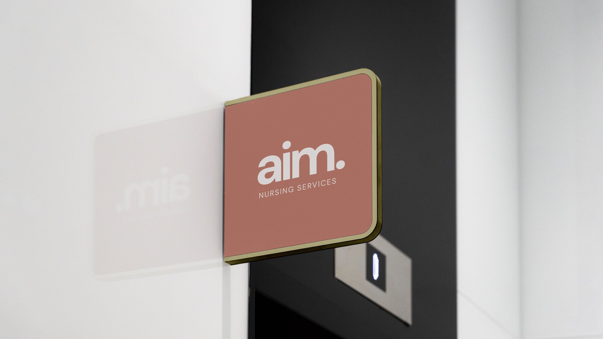
A clean, minimal brand that doesn’t feel sterile — that was the brief. We created a calm, confident identity that lets trust take the lead. The lowercase wordmark is soft-spoken but grounded, with a single period that acts as both a visual anchor and a nod to the name: AIM. The whole thing is pared back on purpose, giving space for the work — and the care — to shine. Muted colours, structured type, and a strong sense of stillness come together to support a business built on support.